

Welcome To Tarec Gorilla Safaris Blog
Welcome to the Tarec Gorilla Safaris travel and tourism blog, your source for informative stories, travel updates, safari guides, and the latest happenings in Uganda and Rwanda. Our goal is to keep travelers informed while helping them discover the incredible experiences waiting for them across East Africa. Uganda and Rwanda are among Africa’s most remarkable…
Welcome to the Tarec Gorilla Safaris travel and tourism blog, your source for informative stories, travel updates, safari guides, and the latest happenings in Uganda and Rwanda. Our goal is to keep travelers informed while helping them discover the incredible experiences waiting for them across East Africa.
Uganda and Rwanda are among Africa’s most remarkable tourism destinations. From mist-covered mountain forests and endangered mountain gorillas to expansive savannahs, beautiful lakes, vibrant communities, and diverse wildlife, both countries offer unforgettable experiences for travelers. Through this blog, we bring these destinations closer to you with useful and engaging travel information.
Latest Uganda and Rwanda Tourism Updates
The tourism industry is constantly changing. New attractions are being developed, conservation programs are introduced, travel routes change, and new experiences become available to visitors.
Our blog follows these developments so that you can make better-informed decisions when planning your safari.
You will find articles covering Uganda tourism, Rwanda tourism, gorilla trekking, wildlife safaris, conservation, travel advice, accommodation, cultural experiences, national parks, and safari destinations.

Whether you are planning a trip several months in advance or already preparing for your African adventure, our latest updates can help you understand what to expect.
Authentic Stories From Travelers
Travel experiences are often best understood through the people who have experienced them.
That is why we also share stories and experiences from travelers who explore Uganda and Rwanda with Tarec Gorilla Safaris. These stories provide practical insights into what it is like to travel through East Africa, trek through rainforest trails, encounter mountain gorillas, explore national parks, and interact with local communities.
From a first-time visitor’s excitement before a gorilla trek to the memories created during a wildlife safari, these experiences can provide inspiration for future travelers.
Our traveler stories can also answer questions that are difficult to understand from a simple itinerary, such as what a gorilla trek actually feels like, how challenging the forest trails can be, and what makes an encounter with wildlife so memorable.
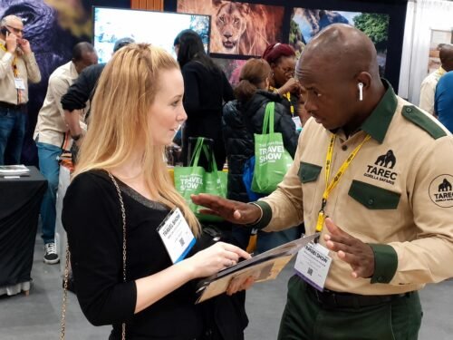
Stories and Insights From Our Safari Guides
Our guides spend much of their time on the road and in Uganda’s national parks. They see the destinations, wildlife, communities, and changing conditions firsthand.
Through their stories, we share practical knowledge about the places our guests visit.
Our guides can provide insights into gorilla behavior, wildlife sightings, national park conditions, local culture, bird watching, conservation, and responsible tourism.
Their experience can also help travelers understand how to prepare for different safari activities.
For example, a guide can explain what to pack for gorilla trekking, how to prepare for a long game drive, or what visitors should know before entering a rainforest.
Discover Uganda’s Gorilla Trekking Destinations
Uganda is one of the world’s leading destinations for mountain gorilla trekking.
Our articles explore destinations such as Bwindi Impenetrable National Park and Mgahinga Gorilla National Park, including the different trekking sectors and what travelers can expect.
You can learn more about Buhoma, Ruhija, Rushaga, and Nkuringo, as well as the gorilla families, trekking conditions, accommodation options, and activities available around these destinations.
We also cover other Ugandan attractions, including Queen Elizabeth National Park, Kibale Forest National Park, Murchison Falls National Park, Lake Mburo, Kidepo Valley, and Lake Bunyonyi.
Explore Rwanda Through Our Travel Stories
Rwanda offers a completely different but equally fascinating safari experience.
Our Rwanda travel articles cover gorilla trekking in Volcanoes National Park, Kigali city experiences, cultural tourism, wildlife, conservation, Nyungwe Forest, Akagera National Park, and other destinations.
By following our updates, travelers can discover how Rwanda’s tourism industry continues to develop while learning about the experiences available to visitors.

Travel Tips You Can Use
Our blog is not only about news. It is also designed to help you prepare for your trip.
You can find practical information about:
- Gorilla trekking permits
- What to pack for a safari
- Best times to visit Uganda and Rwanda
- Gorilla trekking preparation
- Safari accommodation
- Travel routes
- Wildlife experiences
- Cultural activities
- Responsible tourism
- Uganda and Rwanda safari planning
We aim to make complicated travel information simple and useful.
Follow the Journey With Tarec Gorilla Safaris
Every safari creates a story. Some stories begin with a dream of seeing mountain gorillas, while others begin with a desire to explore Africa’s wildlife and cultures.
Through this blog, Tarec Gorilla Safaris will continue sharing the latest tourism updates, informative destination guides, traveler experiences, and stories from our guides.
Whether you are researching your first Uganda gorilla safari, planning a Rwanda adventure, or simply interested in East African tourism, our blog is here to keep you informed and inspired.
Explore our latest Uganda and Rwanda tourism stories, learn from our travelers and guides, and start planning your next African adventure with Tarec Gorilla Safaris.


My latest colour-season question is about Deep Summer versus Soft Winter at home. Online palettes seem simple, yet real fabrics make them blur together. I first set up a small comparison in indirect daylight. Then I removed makeup and bright accessories so they would not influence the result. I noticed that richer colours looked striking while sometimes emphasising tired shadows. Softer blue and berry fabrics felt comfortable, but I may simply prefer them. The useful notes were about clarity, contrast, and how even my skin appeared. A structured color analysis might help me test the same questions again under consistent conditions. I know a digital result cannot settle a close seasonal comparison on its own. How have you checked whether depth or softness is doing more of the work? Experiences with ordinary indoor daylight would help me most. Careful observations seem more valuable to me than a fast seasonal label. I will keep the notes for several weeks before treating the pattern as meaningful. Thanks in advance for examples of what you found genuinely repeatable.
What a refreshing change to find a site that truly listens to its community. My gaming nights have never felt this relaxed and the team goes out of their way to make sure we are happy. Worth every single minute. playfinacasinologin
We are organizing a small wedding that will use cool evening tones. There will be friends who do not all feel good in the same shades. The goal is not to make every person wear the same cool pastel. Our current idea is coordinated cool tones rather than a single prescribed shade. I have been reading about soft winter color palette as one possible reference, without assuming it suits every person equally. It seems easier if we give each person two or three shades and let them choose the most comfortable one. The next step is to compare several combinations in the room where the ceremony will happen. I would appreciate examples from anyone who has coordinated to create harmony without putting everyone in identical outfits? We are also keeping the venue and season in view, because a color that looks elegant on a digital board can change once it meets warm wood, candlelight, and autumn flowers. The aim is a relaxed group photograph, not a technical demonstration of a palette. Comfort matters too, since everyone will be wearing these choices for a long day.
Before spending on another foundation sample I am trying to understand my undertone more carefully. The camera on my phone makes everything look different in the kitchen than they do near a window. This time I want to use the same window and a plain neutral wall. I plan to hold a white card and a muted gray scarf near my face. Rather than treating one image as proof I will keep the light and camera position consistent. As a starting point, this skin undertone test camera keeps the experiment small enough to repeat. Only after the comparison will I try makeup samples on my jaw rather than my wrist. Please let me know if you have found a better neutral reference for this kind of home test? I know a camera cannot replace seeing real skin in changing light, and I am not expecting a perfect answer from one home experiment. My goal is simply to make the next store visit less confusing. Keeping a short record of conditions should also help me recognize when a surprising result is probably caused by lighting rather than my actual coloring.
The first result suggested muted cool colours, so I am planning small experiments. My first step was a pile of familiar garments in slightly different cool shades. I keep the outfit quiet and change only one colour for each comparison. Muted teal, soft navy, and dusty rose seem worth repeating in different lights. I am trying to separate a pleasant colour from one that actually looks harmonious. A what is my color palette might suggest questions to test again with fabrics I already understand. A possible season should not make everyday choices feel unnecessarily rigid. A repeated comparison helps me avoid reacting to one unusually good lighting moment. Which small wardrobe experiment gave you the clearest information? I am interested in methods that do not require a complete wardrobe reset. I would rather build confidence through repetition than make a fast declaration. I will keep the useful notes even if the first seasonal result changes later. Thank you for ideas that keep the process practical and low pressure.
I am revisiting my seasonal analysis because olive skin can produce contradictory results. My hair is very dark and my eyes are medium brown, so the overall contrast can look winter-like. Yet in some lighting my skin has a green-gold cast that automated tools often interpret as warm. Clear orange looks harsh on me while cool berry and deep teal are usually easier to wear. This repeated contrast leaves me unsure whether I belong in a cool winter range or a softer neighboring season. olive skin tone seasonal palette may help organize the clues but I do not want to force the result to match one chart. For an at-home test would you compare pure white with cream before testing accent colors? Both common metals seem acceptable so I need clues that work better for olive skin. I can make controlled daylight photos and review whether shadows, redness, or eye definition change. Which winter colors would you test first without relying on stereotypes about skin depth? Observations from olive-toned members would be especially useful. I care more about repeatable tests than matching every traditional description perfectly. I appreciate any practical suggestions
I have been attempting a simple undertone check with my phone, but the result changes every time I move rooms. The screen brightness seem to change the apparent balance of my skin much more than I expected. For a cleaner comparison, I want to take several photos near the same window on separate days. I plan to set makeup, filters, and automatic colour effects out of the process. Instead of using one quick snapshot I would compare a few neutral fabrics beside my face. Cool pink, muted rose, silver grey, and soft navy would give me more than one clue to consider. It may help to write down whether each shade makes shadows, redness, or unevenness more noticeable. I will review the pictures later instead of judging them immediately. This is the reference I am using before I repeat the test: skin undertone test camera Do you have a low-effort routine that reduces misleading camera colour?
I am trying to choose between Soft Winter and Deep Winter before replacing a few wardrobe basics. Most palette examples online make both directions seem reasonable when I look at them separately. Even with darker colouring, I do not want to assume that the deepest colours are automatically best. On an ordinary overcast day some berry shades look clear while others make my face seem flatter. I keep testing charcoal, navy, and softer grey fabrics rather than relying on one dramatic colour. A friend suggested plain photos and the same lighting so that the comparison stays fair. I want the same daylight conditions whenever I put two colours side by side. To keep the notes consistent, I am looking at color analysis It gives me a smaller shortlist to assess with real fabrics. How do you separate these two palettes when neither result feels completely clear?
Estoy pensando en hacer una escapada de una noche cerca de Barcelona por mi cuenta y me atrae la idea de dormir en una burbuja, aunque quiero plantearlo con bastante sentido practico. En este tipo de plan me fijo en la privacidad real, la iluminacion del camino y la facilidad para contactar con el alojamiento si surge una duda. No quiero encontrarme con un sitio donde las parcelas esten demasiado juntas o donde la descripcion deje preguntas basicas sin responder. hotel burbuja barcelona Cuando busco informacion me fijo mas en detalles como ruido, limpieza, acceso nocturno y trato del personal que en fotografias muy retocadas. Antes de elegir me sirve que la descripcion explique con claridad la distribucion del espacio. Agradeceria saber si hay normas claras sobre llegadas tardias, desayuno y uso de las zonas comunes. Una resena honesta vale mas para mi que una promesa demasiado perfecta. No busco una estancia perfecta. Para mi bastan tranquilidad, buena organizacion y un espacio donde descansar sin incomodidad. Si habeis viajado asi ?que senales os sirvieron para saber que el lugar era adecuado?
Estamos valorando una escapada corta por Alicante fuera de temporada alta y nos gustaria que fuera comoda, sin gastar de mas ni llegar con expectativas poco realistas. Nos apetece contar con jacuzzi despues de un paseo, pero queremos entender bien si es privado, como se reserva y que condiciones tiene segun el tiempo. Nos parece razonable comprobar que servicios estan incluidos y si existen suplementos que no aparecen claros en el primer anuncio. hotel burbuja alicante con jacuzzi Las fotos de muchas opciones llaman la atencion pero preferimos conocer detalles sobre limpieza, horario de entrada, calefaccion y distancia a restaurantes o tiendas. Antes de elegir una fecha nos ayuda que los servicios y sus horarios esten explicados sin ambiguedades. No nos apetece encontrarnos con situaciones donde el entorno sea ruidoso o el uso de las instalaciones tenga limitaciones inesperadas. Una confirmacion sencilla nos permitiria reservar con tranquilidad y sin sorpresas despues. No queremos que todo sea perfecto. Nos conformamos con comodidad, informacion honesta y tiempo para descansar juntos. Quien tenga experiencia en la zona ?que pregunta conviene hacer antes de confirmar la reserva?
I have been trying to understand my color season, but the outcome keeps moving between two neighboring palettes. One quiz calls me Soft Summer while another leans toward Soft Autumn. My undertone looks mostly neutral and both muted ranges seem plausible in indoor light. I compared several photos but camera settings may be influencing what I see. Before changing my wardrobe I would like a more repeatable way to compare the options. seasonal palette test seems like a useful reference rather than a final verdict. Would you start with undertone or compare chroma and contrast before temperature? I can gather some simple color drapes so I am happy to do a careful home check. A bright window gives neutral light and I can keep the camera exposure fixed. What signs would convince you that one muted season is more accurate than the other? I am especially interested in practical checks from people who have worked through a similar overlap. One final concern is avoiding changes caused only by camera white balance. It would also help to learn how many comparisons are usually enough before a pattern becomes clear. Any experience would be welcome
I am choosing a new profile photo and noticed that my face looks noticeably different across pictures taken on the same day. In a close camera shot it looks wider, while a portrait taken from farther away gives me another impression entirely. I realize lighting can affect the outline, but I would like to compare the pictures without overinterpreting one frame. My original search was about skin tone analysis and that reminded me how much camera conditions can affect appearance judgments. I am now trying to look at face proportions as a separate issue. I could compare shots made at the same distance and note whether the forehead, cheekbones and jaw look consistent across them. A simple face shape check could provide a starting point, but I do not expect one result to settle which photo is best. Have you found that using the same camera distance makes these comparisons more reliable? I would also like to know whether a relaxed expression is better than a posed smile when checking the outline. I am looking for a simple repeatable method before picking a picture to use.
I’m thinking about changing my hair color, but I want to understand my undertone first. The camera seems to give me a different answer in every room. In daylight my skin looks fairly neutral, while the bathroom light makes it look much warmer. I know a camera can shift colors. I don’t want to pick a hair shade based on one misleading picture. Would you photograph the same face in steady natural light? I’m also unsure whether to compare my face with a white shirt, a gray background, or several fabric colors. The usual vein test has not helped me much. I found this page while looking into skin undertone test camera and plan to use it as a starting point for comparing colors rather than treating one result as a verdict. If you’ve tested this yourself, what setup gave you the most consistent photos? I can keep my clothing the same across photos. That would give me a more consistent comparison. I’d especially appreciate advice from anyone who checked their palette before making a hair appointment. I’m happy to repeat the test under better conditions.
I have booked my first proper color appointment, and I am trying to arrive with a useful description instead of a heavily edited photo. My natural hair is a medium brown and my skin is fair, so I am considering a cooler change rather than a bright copper or golden blonde. The photos on my phone make every shade look more polished than it might in daylight. I cannot tell which of those shades would still look balanced when I am outside or under office lighting. I would like to compare two nearby shades. I would prefer a result that can grow out without urgent touch-ups. I am using cool summer hair color ideas as vocabulary for the consultation, not as a strict rule about what I should choose. Would a few strands held near my face be a useful test? I can take pictures in natural light, but I am unsure how much to trust a phone camera’s color balance. The cut itself will remove several inches, so I would rather make the color decision thoughtfully than change everything at once. A modest first step would give me something concrete to judge. If you have made a similar first change, what did you ask your stylist before mixing color? I am especially interested in how you weighed everyday lighting, upkeep and the condition of your own hair.
I am preparing a remote consultation for a new hair-color client because the client cannot visit the salon until the day we perform an in-person strand test. I need notes that remain useful when we later compare real swatches. The difficulty is that her webcam adds warmth while the reference photographs she sent were taken under several kinds of indoor lighting. I do not want to diagnose an exact season remotely, but I would like the conversation to narrow down sensible shade families before the appointment. I plan to share this online color analysis to organize observations that we can verify later in person. Should I request a daylight image with a neutral object in frame, and is it worth comparing the same image on two devices during the call? I will separately record prior treatments and maintenance preferences. I would appreciate a cautious checklist from stylists who consult online.
I need to renew an ID photo soon, and I am thinking about tidying up my hair color before the appointment. The last color has washed out more on the ends than near the roots. It is not a disaster, but it becomes obvious in direct light, especially when I pull my hair behind my ears. I have gray eyes, and I keep finding confident online rules about which hair shades must complement them. Several photos show colors that would be a big change for me. The advice seems to ignore the uneven color I am starting from. I looked at best hair color for gray eyes to collect possibilities, but I do not want to choose a box shade solely because it suits someone else’s photograph. I would be happy with a subtle correction that still feels like me. I want to recognize myself when I see the picture years from now. Would you ask a colorist to assess the old dye first? I can bring daylight photos of the current color and explain when the previous dye was applied. I suspect the dye history is more useful than a generic color chart. I am also willing to postpone the photo if the safest fix takes more than one visit. If you have handled uneven fading, which details helped your colorist set realistic expectations?
I am trying to make my wardrobe smaller, and I would rather understand which colors I actually wear well before buying anything new. I started with the clothes I already own. The same blue looks calm next to my face by a window, but oddly harsh under the warm bulbs in my room. That difference is enough to make me hesitate. I have been reading about personal color analysis as a way to give these comparisons some structure. I would use the same spot for every fabric. I can set aside an hour on a bright morning. I would place a few fabrics near my face, keep the background neutral, and take notes instead of trusting a single photo. Would you begin with warm and cool versions? I could write down what changes with each fabric. I am also unsure whether to include makeup, since it might change the result I am trying to observe. I would like a method I can repeat later. If you have tested colors this way, what did you look for in your face and eyes, and which differences were too subtle to trust? I want to keep the pieces that work, not replace everything. Any practical order for the comparisons would be appreciated.
I need new glasses and am deciding between warm tortoiseshell and dark blue frames. A seasonal quiz gave me an Autumn result, but I am unsure which frame looks better beside my face. The shop lighting is warm, and both options look different outside. Since I wear glasses every day, I want a choice that feels comfortable with ordinary clothes as well as with my skin tone. I have tried each frame with a cream top and a cool gray top, but that also changes the background against which I judge them. My current idea is to take a short video in indirect daylight while keeping the camera exposure fixed. I could also ask a friend to look at the frames in person, since a phone image may exaggerate the warmth of the store lights. While looking up palette terms, I found a page about what is my color palette as a starting point, but I would like a method that works for this purchase, even if my season label remains uncertain. Would you judge the frame against bare skin first, or would you focus on how they balance the color of the eyebrows and eyes? I can make another trip when the light is better. I want to compare them properly. Any practical frame comparison would help. I can keep reference photos of both options.
I want to give a friend a scarf, but I cannot ask her to try on colors without spoiling the surprise. Her photos vary in lighting, so I cannot reliably assign her a season. Her everyday outfits tend to include dark denim, simple knitwear and a couple of patterned shirts. That tells me what she likes wearing, but not necessarily which shade of scarf will look good close to her face. I came across personal color analysis because I wanted to understand why two versions of the same color can have such different effects. I do not want to treat an online chart as a diagnosis based on one photograph. Would you look first for a color she already wears near her face, or a quieter neutral that can sit with her coats? The store offers a warm rust, a cool berry and a muted blue, with the same fabric in each shade. I could look through a few recent photos for repeated color choices, though I know cameras and filters are imperfect. A gift receipt seems sensible so she can exchange it if the shade feels wrong in person. The feel of the fabric is another clue I can check. If you were choosing without a draping session, which clues would you trust, and which would you ignore?
I tried comparing a few fabric colors against my face, but the photos from my phone are not consistent. Under the kitchen light my skin looks much warmer than it does in daylight. That makes it hard to tell whether a cream or a clear white fabric is actually more flattering. I have read a little about skin tone analysis and would like to use a fair setup before drawing conclusions. I could stand beside a bright window and take both photos in the same spot, at the same time, with the same camera settings. Is it enough to lock exposure on the phone, or would that make the comparison more complicated than it needs to be? I also wonder whether a plain background matters as much as the light falling on the face. I want to compare the fabric rather than the camera’s processing. If you know a reliable photo setup, what would you control first, and what signs would make you retake the pictures?
I am planning a small family photo session at home, and I want everyone to look like themselves rather than wear matching outfits. The room has one large window and a plain wall we can use as a backdrop. I considered hanging a vivid blue backdrop. I worry it will pull attention away from faces. A neutral cloth might be calmer, although beige seems to wash out one person’s pale shirt. We have a mix of skin tones and nobody wants to purchase an outfit just for one afternoon. I have been reading about color analysis as one way to think about contrast, while keeping the actual clothing choices flexible. Would you test the backdrop first with each person standing in the same patch of window light? I could take a set of plain phone photos and compare them side by side before we commit to the setup. I would appreciate an easy check for balancing clothing colors with the background without making the group look artificially coordinated. How do you keep the faces prominent in a mixed group? We can move the session to another wall and I am open to testing rather than guessing.
I am packing for a three day work trip and trying to make one small bag cover several meetings. The pieces I want to reuse are a grey jacket, navy trousers and comfortable shoes rather than several complete outfits. Choosing a few interchangeable tops is harder than expected, especially when I also want each outfit to feel different. I have been reading about color analysis yet my priority is checking existing combinations instead of replacing my wardrobe to match a seasonal label. Does alternating light and deeper tops create enough variety, or would you choose a narrower range of shades? I also need something for an informal dinner where I would prefer to reuse the jacket in a less formal way. What would you prioritize when building a few distinct combinations from these pieces without adding much to the bag?
While clearing out my wardrobe for a move, I keep finding tops that serve almost the same purpose. Most pieces look fine separately, but combining their colors with the trousers I actually wear is much harder. My aim is to keep fewer clothes while preserving some variety, because wearing the same combination daily would bore me. I have started laying clothes together on the bed to distinguish useful combinations from purchases that need extra items. I found a page about color analysis and would like to use the idea as a starting point for these comparisons. I usually reach for dark blue, whereas cream, rust, and dusty pink leave me unsure about possible combinations. Is choosing two dependable neutrals a sensible starting point, or would you first look for one versatile accent color? Another question is how to tell whether a disappointing outfit comes from its color or from the garment shape. I would appreciate a practical sorting rule from someone who has kept fewer clothes without losing useful outfit choices.
Собираюсь съездить из Берлина в Потсдам на день и пытаюсь составить маршрут, который не потребует постоянной спешки. Выезжать до рассвета не хочется, а вечером нужно вернуться в город к заранее назначенной встрече. Поэтому ищу не список всех достопримечательностей, а понятную последовательность дороги и прогулки с запасом времени. Пока разбирался с транспортом, сохранил страницу по теме потсдам сан-суси как добраться — это отправная точка для дальнейших уточнений. С собой планирую взять воду и небольшой перекус, но остановку на обед тоже хотелось бы предусмотреть. Для меня это первая поездка в Потсдам, поэтому расстояния по карте пока трудно соотнести с реальной прогулкой. Буду благодарен за совет о начале прогулки: какую точку вы выбрали бы при таком ограничении времени? Особенно интересует, стоит ли сначала идти в парк или оставить его после короткой прогулки по центру. Внутренние экскурсии пока не включаю: не хочется привязывать весь день к одному билету и конкретному часу. Если мой план переоценивает доступное время, помогите выбрать, от чего отказаться, чтобы поездка осталась приятной.
Планирую прилететь в Мадрид вечером и сразу уехать к месту ночёвки. Адрес квартиры ещё не определён, и транспорт может повлиять на выбор района. Будет небольшой чемодан, а после дороги не хочется долго искать пересадки. Пока выписал метро, поезд и автобус, чтобы сопоставить их с адресом жилья. Отдельно хочу заложить запас на выход из самолёта и поиск нужной остановки. Неясно и то, насколько удобно покупать билет человеку, который впервые приехал в город. При задержке рейса хотелось бы иметь другой маршрут, который действительно доступен вечером. Интересны конкретные примеры: терминал прилёта, время выхода и конечный район. как добраться из аэропорта мадрида в центр — такой материал использую как отправную точку. Расписания и условия проезда хочу проверить перед вылетом; сейчас важнее понять, какие детали стоит уточнить для своего рейса. Также интересно, насколько легко ориентироваться по указателям после прилёта и стоит ли заранее сохранить схему переходов на телефон, чтобы пользоваться ею без интернета.
Планируем отпуск небольшой компанией и хотим ездить к морю общественным транспортом. Жильё пока выбираем, поэтому есть возможность заранее проверить, насколько удобно добираться до нескольких разных пляжей. Не хочется каждый день проводить половину времени в пересадках. Но ограничивать весь отпуск одним участком берега не хотелось бы. Пока составляем небольшой список выездов и для каждого отдельно проверяем путь туда и обратно. Самое слабое место плана — возвращение вечером. Для общей оценки расходов смотрим тему цены в испании и дополнительно сравниваем выезды по удобству дороги. Хотим проверять последний рейс вместе с расстоянием от берега до остановки. Особенно если кто-то задержится за ужином или группе понадобится больше времени на сборы. Хочется также узнать, легко ли купить обратный билет заранее и где лучше проверять изменения расписания перед выездом. Какие пляжные выезды вы бы оставили в таком формате? Подскажите также, какой запас времени вы обычно оставляете на обратную дорогу.
Подбираю небольшой подарок из Праги для родственницы, которая интересуется уходовыми средствами и обычно внимательно читает состав перед покупкой. Не хотелось бы выбирать только по красивой упаковке или рассказу продавца, особенно когда на месте будет мало времени для сравнения. Пока ищу полезный материал по запросу чешская косметика. Пытаюсь понять, какие сведения на упаковке действительно помогут сделать выбор, а какие относятся скорее к оформлению и рекламному описанию. Предпочтения получателя уточню заранее и не буду искать средство для решения проблем с кожей, поскольку подарок не заменяет индивидуальную консультацию. Отдельно проверю объём упаковки, срок годности и условия перевозки, чтобы удачная на первый взгляд покупка не создала трудностей в дороге. Поделитесь опытом покупки: на какие детали этикетки вы смотрели сначала и что помогало отказаться от неподходящего средства ещё в магазине. Если знаете удобный порядок проверки перед покупкой, опишите его: хочется оставить место личным предпочтениям и избежать поспешного выбора по внешнему виду.
Перенёс заметки на новый телефон и занялся старыми туристическими ссылками. За несколько поездок накопились страницы, скриншоты и короткие подписи, смысл которых уже не всегда понятен. Некоторые материалы сохраняли для реального выезда, другие просто казались интересными. Хочу оставить небольшой список с понятными пояснениями. Удалять всё подряд жалко, но хранить хаос тоже неудобно. Среди неподписанных записей нашлась ссылка с пометкой venagid — думаю отмечать рядом, зачем мы сохранили конкретную страницу. Не собираюсь считать старую закладку готовой инструкцией. Если снова понадобится соответствующая тема, проверим условия заново и зафиксируем дату этой проверки. Пока предлагаю три поля: тема, источник и вопрос. В отдельной строке можно отметить дату последнего чтения. А непроверенные детали выделять короткой заметкой. Список общий, и им пользуются несколько человек, поэтому подпись должна быть понятной без объяснения автора. Хочется открывать заметку и сразу видеть, что осталось выяснить перед поездкой. Как вы отличаете полезный источник от случайной ссылки, когда возвращаетесь к заметкам через год? Покажите удобный пример подписи без личных данных.
Fur eine knappe Woche in Andalusien uberlegen wir, welche Orte am Meer sich ohne Mietwagen gut kombinieren lassen. Wir reisen zu zweit und mochten nicht jeden zweiten Tag die Unterkunft wechseln. Wir wurden gern auch abends zu Fu? durch eine Altstadt gehen. Langere Strecken wurden wir gern mit der Bahn zurucklegen. Ein kurzer Busabschnitt am Ende ware aber kein Problem. Die Fahrt sollte nicht aus einer langen Folge von Umstiegen bestehen. Wir mochten in jedem ausgewahlten Ort mindestens zwei Nachte bleiben. Ein Strand in erreichbarer Nahe ware schon, auch wenn er nicht vor dem Hotel liegt. Ob die Alltagswege bequem sind, kann ich vorab kaum einschatzen. Bei der Suche habe ich andalusien schone orte am meer notiert. Welche zwei Orte wurdet ihr unter diesen Bedingungen auswahlen? Uns helfen Erfahrungen zu Bahnhofen, Wegen in die Altstadt und dem Zugang zum Strand mehr als eine lange Liste von Sehenswurdigkeiten. Auch Hinweise zu Gepack und zur Lage geeigneter Unterkunfte waren hilfreich. Wir mochten genug freie Zeit fur beide Orte behalten und die Reise nicht durch standiges Packen zerlegen.
Fur einen kurzen Aufenthalt in Alicante suche ich Ideen, die sich gut zu Fu? verbinden lassen. Meine Unterkunft liegt beim Bahnhof. Morgens mochte ich durch die Altstadt gehen, spater am Wasser sitzen und zwischendurch etwas essen. Den Vormittag mochte ich fur die Gassen und Platze im Zentrum nutzen. Die kleinen Gassen oberhalb des Zentrums klingen schon; ich wei? nur nicht, ob sie in der Mittagshitze angenehm sind. Bei der Suche nach alicante santa cruz habe ich ein paar Karten und Beschreibungen gefunden. Vor Ort ist die Frage fur mich eher, wie man die Wege sinnvoll legt und wo man unterwegs eine Pause einlegt. Welche Route vom Bahnhof durch Santa Cruz bis ans Meer wurdet ihr empfehlen? Ein langer Strandtag ist nicht geplant; eine Stunde am Wasser wurde mir reichen. Das Castillo ware nur dann eine Option, wenn der Weg und die Temperaturen noch passen. Falls der Aufstieg zu viel wird, lasse ich das Castillo einfach aus. Lieber sehe ich weniger Orte und habe dafur Zeit, die Stadt wirklich wahrzunehmen. Falls ihr Alicante ohne Auto besucht habt: Wo habt ihr mittags pausiert, und welcher Abschnitt war zu Fu? besonders lohnend? Hinweise zu Schatten und Steigungen waren hilfreich. Bei Bedarf kann ich den Ruckweg mit der Stra?enbahn abkurzen. Ich freue mich uber personliche Erfahrungen und kleine praktische Tipps.
I have a salon appointment coming up, and I am trying to narrow down a hair color before I get there. I recently started reading about color analysis because the tones I like in photos do not always look the same next to my face. It has been a long time since I last changed the color, and I want to go slowly. The result suggests a cooler palette, but I am treating that as a starting point rather than a rule. My natural hair is medium brown, and I want a change that is noticeable without committing to constant upkeep. Photos of muted brown and darker blonde appeal to me, but salon lighting may be doing much of the work. I also know that a dye swatch can look different against skin, eyebrows, and the color already in the hair. Is it more useful to hold actual swatches beside the face than to rely on a season name? I can bring daylight photos and explain my maintenance budget. I would rather discuss the result as a clue than hand over a quiz result as an instruction. A strand test might show how the color takes on my actual hair. If you have made a similar change, which small details helped you avoid a color that looked too flat or too harsh? Examples from people who started with medium brown hair would help me compare options.
Estoy preparando una escapada de dos noches a Granada porque me gustaria fotografiar el cielo y, al mismo tiempo, dormir en un sitio tranquilo. La experiencia de dormir bajo las estrellas me llama la atencion, pero las fotos de las fichas no siempre explican lo que se ve realmente desde la cama. En mi caso, la oscuridad del entorno importa mas que una decoracion vistosa. La reserva seria para un fin de semana. Tambien me preocupa que el plastico se empane o que la temperatura cambie mucho durante la noche. ?Que tal resulta pasar la noche alli cuando refresca despues de cenar? He visto esta pagina sobre hotel burbuja granada y la estoy usando para ordenar opciones antes de preguntar a cada alojamiento por separado. Revisare la nubosidad unos dias antes. Me interesa averiguar si la privacidad se mantiene al encender las luces interiores. Otro detalle es la llegada: llevare tripode y una bolsa de equipo, asi que agradeceria saber si el acceso desde el aparcamiento es sencillo. No necesito una recomendacion de lujo, sino informacion concreta sobre el lugar. Si alguien conoce un alojamiento de la zona, ?preguntariais primero por orientacion, calefaccion o normas para salir a hacer fotos de madrugada? Agradecere especialmente comentarios de quienes hayan ido con intencion de mirar el cielo. Gracias por compartir lo que os resulto comodo y lo que revisariais antes de repetir.
I have a free morning in Madeira and would like to spend it at one landscape viewpoint rather than moving between several stops for photographs. My starting point will be Funchal and I will not have a car, which makes the journey back as important as the view itself. A mid-morning visit would suit me well, and I would prefer a place where I can walk safely and wait if a cloud passes through. Some dramatic viewpoints appear easy on a map, but a steep final road or infrequent bus could make the outing much longer than expected. I would take an accessible place over the most spectacular photograph, especially if conditions higher up are unsettled. One article that helped me start comparing areas was 3 days in madeira without a car but I am checking individual routes instead of assuming every suggested stop works by bus. Which accessible area would you choose for a single morning? A short taxi ride for the last section is possible, although I would still want a clear way to return. I can keep the morning flexible around the forecast, and I would check current access information before setting off. A practical route and an honest estimate of travel time would be ideal.
I am choosing where to stay in southern Tenerife for a summer break, and the descriptions of the resort areas are starting to blur together. The main thing I want is somewhere I can walk to the sea in the morning and still find a calm place to eat in the evening. I do not need nightlife, but I also do not want to depend on a car for every meal or short walk. I started comparing beaches in tenerife south and now I am trying to separate the beach itself from the feel of the streets around it. Several locations look close to everything, yet reviews suggest that a short distance can still involve steep roads or traffic. I would rather find an easy place to return to than spend each day travelling across the island to find a quieter stretch of sand. Which neighbourhood would you consider for a solo traveller who likes swimming, coastal walks, and early evenings? I can take a bus or taxi for occasional excursions, so perfect access to every attraction is not necessary. Advice about the streets behind the beach would be useful, especially from someone who has stayed nearby. I would love to hear what daily life there actually feels like.
We’re comparing apartments for a short family trip to Tenerife and keep coming back to Playa de las Americas. The area looks convenient, but listings that appear similar can be very different once I look at their exact location. I’ve been checking are there any holiday rentals available in playa de las americas, canary islands, spain? and found plenty of results, so availability alone doesn’t help us choose. What matters most is an easy walk for meals, a practical route to the beach, and a place where evenings aren’t dominated by noise. A listing doesn’t always explain the route from the building to the promenade or whether the bedroom faces a busy street. I plan to check recent guest comments, the exact map pin, and whether the stated sleeping arrangements really work for our group. Is it reasonable to ask about street-facing rooms and late-evening noise before paying, or is there another detail visitors often miss? We won’t have a car every day so a manageable uphill return matters more to us than a slightly better view. I’m also unsure about which nearby streets feel calmer while still being convenient for a family arriving after a flight. If you booked there recently, what checks helped you avoid a poor fit, and which listing details turned out to matter most in practice?
I have three full days in Madeira and will be staying in Funchal without renting a car. I would love to visit another part of the island, but I am trying to avoid an itinerary that only works if every connection is perfectly timed. A day trip to a coastal village sounds possible, and another for a manageable walk if the forecast cooperates. The bus schedules look workable on paper, although I cannot tell how much time to allow for transfers, stops, and a relaxed lunch. I started planning with 3 days in madeira without a car and it helped me list possible places rather than commit to a rigid schedule. Would you keep the last day flexible in Funchal, in case mountain cloud or a missed connection changes the earlier plans? I may book a guided transfer for one walk, while another option is to keep every outing reachable by public transport. If you have done a similar trip, which day trip felt practical, and what would you skip on a three-day visit? A little spare time between outings would be welcome.
Estoy preparando una escapada de dos noches a Granada porque me gustaria fotografiar el cielo y, al mismo tiempo, dormir en un sitio tranquilo. La experiencia de dormir bajo las estrellas me llama la atencion, pero las fotos de las fichas no siempre explican lo que se ve realmente desde la cama. Prefiero una zona con poca iluminacion exterior a una habitacion con muchos accesorios. La reserva seria para un fin de semana. Tambien me preocupa que el plastico se empane o que la temperatura cambie mucho durante la noche. ?Alguien ha ido en primavera y puede contar como fue el descanso? He visto esta pagina sobre hotel burbuja granada y la estoy usando para ordenar opciones antes de preguntar a cada alojamiento por separado. Revisare la nubosidad unos dias antes. Quisiera saber cuanto espacio hay entre las burbujas y si se oyen los vecinos. Otro detalle es la llegada: llevare tripode y una bolsa de equipo, asi que agradeceria saber si el acceso desde el aparcamiento es sencillo. Me servirian experiencias directas, incluso si alguna cosa no salio perfecta. Si alguien conoce un alojamiento de la zona, ?preguntariais primero por orientacion, calefaccion o normas para salir a hacer fotos de madrugada? Agradecere especialmente comentarios de quienes hayan ido con intencion de mirar el cielo. Gracias por compartir lo que os resulto comodo y lo que revisariais antes de repetir.
I am planning an online first meeting before a color appointment because the client cannot visit the salon until the day we perform an in-person strand test. I need notes that remain useful when we later compare real swatches. The difficulty is that her webcam adds warmth while the reference photographs she sent were taken under several kinds of indoor lighting. I am avoiding firm conclusions from compressed video, but I would like the conversation to narrow down sensible shade families before the appointment. I found this online color analysis to organize observations that we can verify later in person. Would it help to ask for one daylight photo beside a gray card, and is it worth comparing the same image on two devices during the call? I will separately record prior treatments and maintenance preferences. I would appreciate a cautious checklist from stylists who consult online.
I have a hair appointment coming up and want to check whether Deep Summer or Deep Winter suits me before choosing a darker shade. I have been holding dark fabrics beside my face. Black gives a strong outline, yet a softened charcoal sometimes makes my features look less tired. I am unsure which effect looks more balanced. The descriptions of deep summer color palette give me useful terms, but I still need to test them against real fabric. I would keep makeup the same for each comparison. I can put together a small set of dark fabric samples. I plan to compare them in daylight with my hair pulled back, so the current hair color does not dominate every impression. Would you compare softened navy with clear navy? I could record the effect around my eyes for each fabric. I am especially curious whether the skin around my eyes looks smoother with one fabric, rather than simply noticing which color I like more. I want the test to inform the appointment, not dictate it. If you have had to separate these two palettes, which comparison pairs revealed a difference you could see consistently? I can repeat the test on another day before deciding. I would appreciate examples using ordinary clothes rather than specialized draping kits.
I want a subtle change to my hair, with a maintenance schedule I can actually keep. My natural shade is dark blonde, and most of the inspiration pictures I save show a much bigger transformation. The effect around the face appeals to me more than the full transformation or its upkeep. I would rather make one modest change first and see how it feels over time. Reading about my color palette gave me another way to think about the shades I keep choosing. A palette may be helpful, but I do not want it to dictate every strand of hair. Some photos show cool beige pieces, while others lean golden; both can look convincing under studio lights. I would prefer a soft grow out and a tone that still makes sense when my natural roots show. I could bring unfiltered daylight pictures of my current hair and a couple of examples of the amount of change I want. Then I could ask the stylist which parts of those examples fit my hair condition and maintenance budget. I am open to a few face framing pieces or a gloss if either option suits the existing color. I also want to ask how the color might fade between appointments. Has anyone used a palette as a loose guide while keeping a low maintenance result?
A neighborhood clothing swap is coming up, so I am making a small checklist before browsing the tables. Previously I brought home several interesting pieces, but none of them worked especially well with the clothes I already had. I plan to keep photos of my usual jeans, skirts and jackets on my phone while looking through the options. I also want to use color analysis as a loose guide, while leaving room for a piece that simply works with several things in my wardrobe. Is it more useful to look for familiar colors or identify a missing layer that could bring existing outfits together? I can check fit there, but the room has artificial lighting and I do not want color alone to decide everything. Which practical question do you ask before choosing a secondhand item that looks appealing but has no obvious outfit yet?
Перед поездкой в Прагу решил составить список подарков и задумался об уходовых средствах для человека с довольно определёнными предпочтениями. Мне удобнее прийти с коротким списком вопросов, чем пытаться разобраться во всех надписях и обещаниях уже у туристической витрины. Пока ищу полезный материал по запросу чешская косметика. Пытаюсь понять, какие сведения на упаковке действительно помогут сделать выбор, а какие относятся скорее к оформлению и рекламному описанию. С медицинскими вопросами экспериментировать не собираюсь: хочется обычный небольшой подарок, который получатель сможет оценить без необходимости менять весь привычный уход. Хочу заранее учесть размер упаковки и правила перевозки, а в магазине обязательно посмотреть срок годности и целостность защитного оформления. Если выбирали подобные подарки, расскажите, какие вопросы задавали продавцу и удавалось ли получить достаточно понятные ответы по составу и аромату. Если знаете удобный порядок проверки перед покупкой, опишите его: хочется оставить место личным предпочтениям и избежать поспешного выбора по внешнему виду.
После смены телефона разбираю наши семейные туристические закладки. За несколько поездок накопились страницы, скриншоты и короткие подписи, смысл которых уже не всегда понятен. Некоторые материалы сохраняли для реального выезда, другие просто казались интересными. Хочу оставить небольшой список с понятными пояснениями. Удалять всё подряд жалко, но хранить хаос тоже неудобно. Среди неподписанных записей нашлась ссылка с пометкой venagid — решил дописывать к похожим ссылкам цель сохранения. Не собираюсь считать старую закладку готовой инструкцией. Если снова понадобится соответствующая тема, проверим условия заново и зафиксируем дату этой проверки. Для начала оставлю тему записи, её источник и открытый вопрос. Рядом хочется записывать, когда мы последний раз читали материал. Сомнительные подробности будем помечать отдельным комментарием. Список общий, и им пользуются несколько человек, поэтому подпись должна быть понятной без объяснения автора. Хочется открывать заметку и сразу видеть, что осталось выяснить перед поездкой. Как вы отличаете полезный источник от случайной ссылки, когда возвращаетесь к заметкам через год? Покажите удобный пример подписи без личных данных.
Our neighborhood clothing swap is next weekend, and I want to arrive with a better plan than last time. Last time I chose pieces that caught my eye, then struggled to make any complete outfits once I got home. My first step is photographing the jeans, jackets and skirts I actually wear so I have something concrete to compare. For organizing the color side, I have been exploring color analysis as a starting point rather than a strict rule that excludes something which already matches my favorite clothes. Is it more useful to look for familiar colors or identify a missing layer that could bring existing outfits together? Trying things on should be possible, although artificial lighting means I do not want to rely entirely on how shades appear. How do you decide whether a promising secondhand piece will earn a place in your regular outfits once you get home?
Во время отдыха в Кобулети хочу выбраться в Уреки на несколько часов, без переезда и ночёвки в другом месте. С продолжительностью поездки ещё не определился: по погоде станет понятно, возвращаться после обеда или немного позже. Поэтому сравниваю варианты транспорта прежде всего по удобству обратного пути, а не только по цене в одну сторону. Для начала сохранил описание как добраться из кобулети в уреки — это отправная точка для дальнейших уточнений. Вещей будет немного: небольшой рюкзак с водой и полотенцем, без большого багажа. Пешая прогулка меня устраивает, но хотелось бы заранее понимать её длину и не тратить половину дня на поиск остановок. Осталось понять, где проверять обратный транспорт и какой пеший участок придётся пройти после прибытия. На давние сообщения с часами отправления полагаться не собираюсь, актуальные условия уточню перед самой поездкой. Поделитесь, пожалуйста, своим порядком действий и тем, о чём лучше спросить ещё до посадки в транспорт. Больше всего интересует запасной вариант возвращения, если погода испортится и оставаться на пляже уже не захочется.
Хотим провести зимнюю неделю на Канарах и сейчас сравниваем возможные базы. Пляж приятен, однако проводить весь отпуск только у воды нам не хочется. Машину брать пока не решили, поэтому внимательно смотрим на автобусные маршруты. Стараемся избежать плана, где переезды занимают больше времени, чем сами остановки. Хотелось бы сочетать короткие прогулки с посещением городков и обычными обеденными паузами. Отдельный вопрос — насколько сильно погода отличается между районами одного острова. Если день окажется дождливым, пригодится запасной вариант без сложного переезда. Интересны советы тех, кто выбирал одну базу и не пытался объехать всё сразу. канарские острова — собираю здесь идеи для обсуждения. Не воспринимаю общий список как готовый маршрут: сначала выберем базу, затем проверим транспорт и оставим несколько дней без обязательной программы. Ещё интересует обычный бытовой вопрос: удобно ли рядом покупать продукты и ужинать вечером, если автобусные поездки занимают значительную часть светлого времени суток.
Хочу провести летний отпуск без постоянной жары и присматриваюсь к северу Испании. Думаю о поездке, в которой можно чередовать прогулки у моря, небольшие города и спокойные дни без плотной программы. Купание хотелось бы оставить приятной возможностью, а не обязательным ежедневным пунктом. Пока трудно выбрать между открытым побережьем и более защищёнными бухтами. На фотографиях оба варианта выглядят привлекательно, а вот ощущения при ветре и пасмурной погоде представить сложнее. Для выбора района сначала изучаю соседние населённые пункты. В частности, рассматриваю города на севере испании и ищу рядом прогулочные маршруты на день без пляжа. Постоянно менять жильё ради новых видов мне не подходит. Предпочитаю остановиться в одном районе и гулять вокруг него. Отдельно рассматриваю доступность магазинов и кафе, чтобы в дождливый день не зависеть от длительной поездки в другой город. Как бы вы совместили спокойный пляжный отдых и прогулки в таком формате? Интересуют личные наблюдения о ветре, подходах к берегу и жизни небольших курортов.
As I let my gray hair grow in, I would rather experiment with existing clothes than assume I need a new wardrobe. For now, the roots and lengths have different colors, and I expect that mixed appearance to last through several more haircuts. There are light neutrals, darker neutrals, and a couple of pink scarves in my closet that I could use as comparison pieces. While looking for a way to describe those differences, I saved this reference on personal color analysis as a starting point for further reading. A seasonal label would be less useful to me than understanding why I prefer particular scarves with my current hair. Would you repeat the same comparison every few months, or wait until most of the old color has been cut away? A short record of preferred combinations might help, especially if I use the same scarf set rather than introducing new pieces each time. What would you try first if the aim were to make this gradual change feel manageable while keeping spending to a minimum?
I am editing a short podcast introduction with music underneath the first sentence. The cue sounds acceptable alone, but the overlap is harder to judge. Before changing the source, I need to check whether the mix itself causes the distraction. I plan to compare versions with the same voice track and music level. The original export would stay in a separate file throughout the comparison. The narrator has a soft delivery, and the cue includes a sustained background layer. I would listen to the opening both on headphones and on a small speaker, noting whether individual words remain easy to follow at a comfortable volume. I came across suno fix while looking for possible approaches to this question. I have not made a processed comparison and do not know whether it would help. A quieter texture would not be useful if it weakened the entrance. How would you organise a brief listening comparison for this kind of overlap?
I am preparing a generated backing guide for a bassist who records remotely. The arrangement is clear enough, although the rough texture could distract from the actual musical instructions. Alongside the guide, I can send tempo information, chords, the key, and notes on bass entrances. Is it useful to provide both the untouched guide and a revised version? One phrase I encountered was suno fix while looking for language to describe the issue, but I have not tested the linked resource. The goal is a clear musical brief that does not turn an unwanted texture into an instruction. The bassist will work in a different recording application, so I would also welcome advice on export format, a shared starting point, and whether a count-in helps prevent alignment mistakes. What would you put in a short delivery checklist for this kind of collaboration?
I am checking a backing track for an upcoming rehearsal. A few passages become harsh in the room, while headphones make the problem harder to identify. I would like to check the playback setup before editing the recording. I can compare another speaker, lower the level, and listen from several positions. How would you arrange those checks to keep the comparison useful? For background, I have been looking into suno fix in this context. I am treating that as context rather than an explanation of what we hear. If the issue persists across systems, I could compare a short edited duplicate with the original. I will use the same excerpt for every comparison, write down the playback level, and ask another person to listen before we make any decision about changing the source recording. The goal is comfortable rehearsal playback without losing the accents musicians need to hear.
I inherited a patterned scarf with a damaged border, and I would like to repair it so I can wear it again. I would rather test carefully than unpick stitches from fragile fabric later. The center is still sound, but the original edging has faded beyond a reliable match. The closest available trims are a subdued green and a noticeably warmer shade of brown. A perfect color match seems impossible, so I am considering a deliberately visible repair. I started looking into color analysis since the new edging would frame my face whenever I wear the scarf loosely. I can pin short samples in place before sewing anything onto the old fabric. Keeping the original feel is important, although I hope to use it regularly afterward. How would you balance harmony with the existing pattern against the effect near the face?
I am choosing a generated instrumental loop for a spoken episode, and the quiet pauses reveal a thin metallic texture. Because the voice carries the episode, I want to assess the music at its intended level rather than in isolation. I can shorten the loop or choose another passage, although either choice changes the pacing around the introduction. I came across remove ai artifacts from audio while looking for ways to frame the decision. Before processing anything, I would like to establish a comparison that reflects how the episode will actually sound. Would an identical narration excerpt be a useful setting for comparing an original with a processed copy? I would keep the music level fixed and include a pause long enough to expose the texture. Listening to the music alone could then reveal whether processing affected percussion or stereo width. How would you decide whether the texture warrants repair in the actual episode?
I am reorganizing a folder of generated songs that has become awkward to search. Some exports have a faint metallic texture, but I also want to remember exactly what came out of each session. Keeping untouched source files seems sensible. The difficult part is deciding what belongs beside them when I make a more comfortable listening copy. Someone pointed me toward sunofix while looking at possible cleanup approaches. I have not processed this collection yet, so I am asking about the filing policy before choosing a tool. Would you give listening copies their own folder? I can record the export date, but I am less sure how much processing detail is useful months later. A brief processing note seems manageable. I have room to retain both versions. What naming convention has stayed understandable for you?
Queremos dedicar una jornada de nuestras vacaciones en Mallorca a conocer alguna bodega y estamos comparando opciones. Preferimos escuchar como trabajan en cada finca antes que encadenar muchas catas en una sola tarde. Para preparar una lista inicial estoy mirando estas bodegas de mallorca. Antes de reservar quisiera confirmar si la visita requiere un grupo minimo y cuanto dura realmente la actividad completa. Tambien necesitamos organizar la vuelta, porque no queremos que nadie tenga que conducir despues de participar en una cata. Una persona no bebe alcohol y nos gustaria que tambien pudiera disfrutar de la explicacion sin sentirse al margen. No buscamos una clasificacion de las mas famosas, sino experiencias explicadas con detalles practicos y expectativas realistas. Ademas, compararemos el precio final por persona y lo que incluye cada reserva, porque una explicacion del vinedo y una degustacion breve pueden ser propuestas diferentes. ?Que detalles os ayudaron a elegir una visita que mereciera la pena para todo el grupo?
I am trying to make a small secondhand work wardrobe feel coherent without replacing everything. Secondhand shops supply most of my work wardrobe, which means color choices depend heavily on what fits. I would like a few pieces that work together instead of a collection of individually appealing bargains. The reliable pieces are a charcoal jacket and a pair of cream shirts that I wear most weeks. I am looking for a sweater next, although checking a huge range of shades is not realistic. Would you compare candidate colors with those existing clothes first, or start with how each looks near your face? I am using this as an introduction to personal color analysis but I do not want a seasonal category to become a reason to discard clothes that already work. What small comparison would you repeat in a shop, and what notes would make the next visit easier?
After a morning bicycle ride, the shape I started with often disappears beneath the pressure of my commuting helmet. The aim is to find a practical hairstyle that survives the journey and needs only a quick adjustment afterwards. A style that looks good with loose hair still has to feel comfortable when I tuck everything under the helmet. I came across a page through a search for try on hair styles for free and would treat a preview as an outline to discuss. I would compare a few lengths in the same photograph, keeping the lighting and head position as consistent as possible. A visual reference leaves practical questions unanswered, especially how a clip or tied section changes the way the helmet sits. At the appointment, I would show the stylist my helmet and describe the quick routine I can manage after commuting. I would like to compare tradeoffs before choosing a shorter cut simply because it looks easier in a reference picture. Has anyone found a good way to compare haircut options while accounting for helmet comfort and a rushed morning routine?
A small game prototype needs a repeating ambient cue for a quiet indoor scene. After several repeats, the boundary starts drawing attention away from the scene. I need to distinguish a poor loop boundary from a sound already present in the export. My initial test would change only the crossfade length at the boundary. I would keep the level and all other edits identical between versions. There is no dramatic change in the room at the repeat point, so the music should not imply one. I would listen to several cycles in context, then inspect the boundary separately, keeping notes about exactly when the interruption becomes apparent. A page about remove suno artifacts came up during my search for another possible check. Without a comparison, I cannot tell whether processing would affect the boundary usefully. A continuous mood matters more here than making every isolated moment polished. How would you test the boundary before deciding whether source processing is worthwhile?
For an introductory audio lesson, I want students to compare several exports of one short passage. A generated instrumental could provide the example, provided students can always return to the original file. The first task would ask students to write listening notes before opening a visual display. I found mp3 to spectrogram as a possible reference while planning the visual part. We would then compare documented export settings using the same passage and a consistent playback level. I want to avoid teaching that every visible difference identifies a defect in the generated source. A worksheet could separate audible observations, export settings, and questions that remain unresolved. There would be no requirement to repair the clip or produce a supposedly perfect version. Students would record the software used for each export so that their comparison can be repeated later. How would you keep this lesson manageable for students learning audio formats for the first time?
I am making a short looping animation with a few small movements and no spoken dialogue. The musical mood seems appropriate, although a continuous bright texture competes with the movement. I am trying to decide whether to revise the sound, choose another sketch, or leave more silence between events. I found the term suno shimmer but I have not established the cause of this particular texture. Do you start by listening against the picture, or listen separately and then check the visual timing? I want the little movements to remain readable without making the whole soundtrack feel empty. The loop will play on a small screen as well as headphones, so I can check both contexts. I would keep the comparison volume consistent and use the same section of animation. What comparison method helps you stay aware of the initial problem after several playbacks?
I am trying to make a small secondhand work wardrobe feel coherent without replacing everything. I buy most work clothes used, and the available sizes often narrow the choice before color enters the picture. I am hoping to connect what I own before adding more isolated bargains to an already crowded rail. A charcoal jacket and two cream shirts are staying, because they fit well and get worn regularly. My next purchase will probably be a knit layer, but I cannot compare every possible shade in person. Would you compare candidate colors with those existing clothes first, or start with how each looks near your face? One subject behind this question is personal color analysis but I do not want a seasonal category to become a reason to discard clothes that already work. How would you keep this process simple enough to use while browsing, with only a few minutes per item?
Our team is updating the staff portraits, and I have been asked to choose two background colors before the photographer arrives. We have time to test this properly before the booking is finalized. Our existing blue backdrop seems to emphasize shadows on several people in the proofs. I want to compare actual sample prints before ordering a large roll of paper. Everyone will wear their own clothes, so a strict coordinated wardrobe is unrealistic. I have been reading about personal color analysis but I am unsure how much that helps when choosing a background for a group. Would neutral reference cards help us compare the proofs without arguing over monitor settings? We can ask the photographer to hold lighting and exposure constant for the test. Has anyone used a practical comparison process that works across several different complexions?